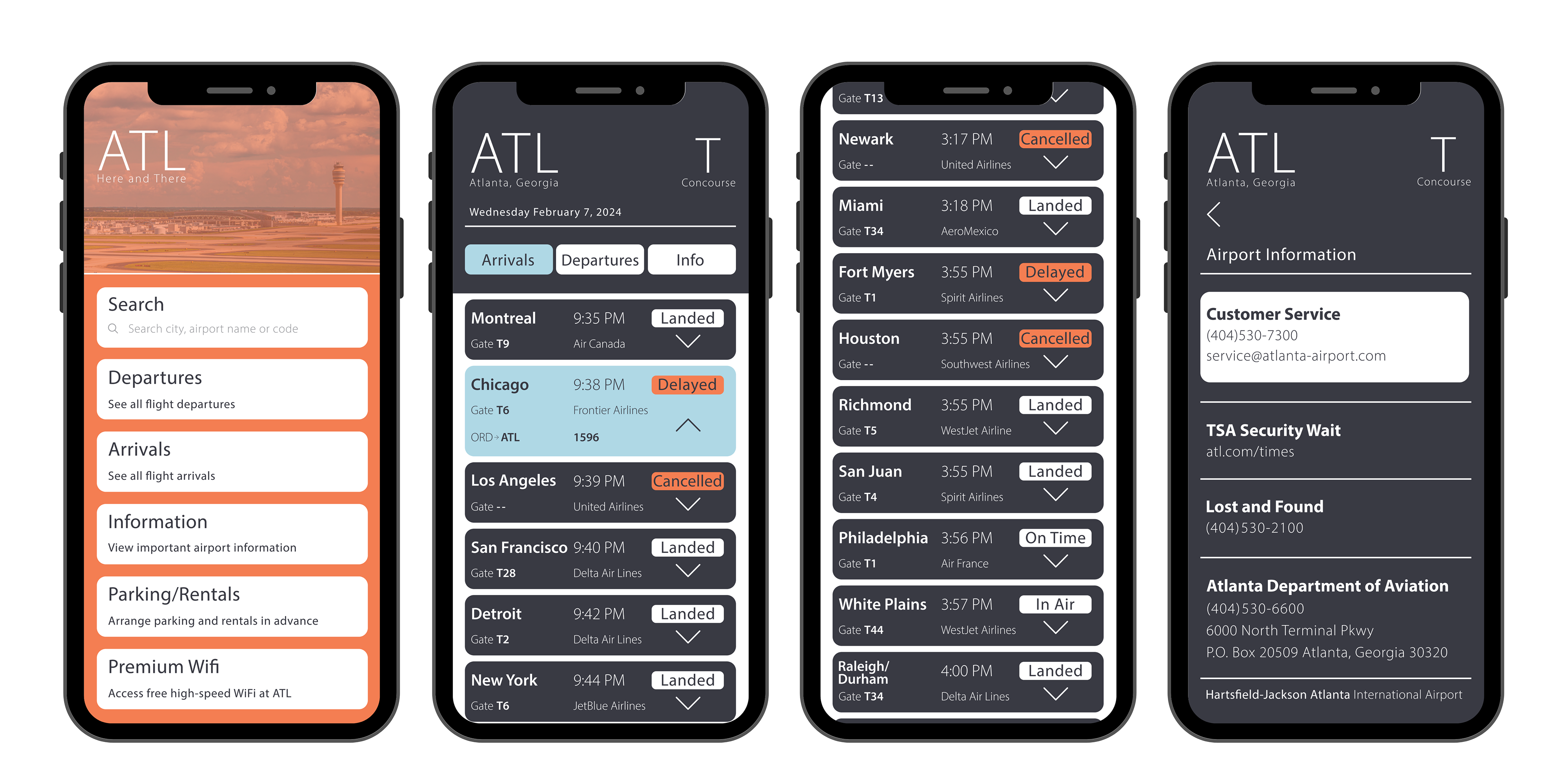
Here and There
The objective of this project was to develop a flight information display system optimized for mobile devices, enabling passengers to receive real-time flight information anywhere with ease. The focus was on designing a clear, concise, and inviting interface, ultimately aiming to foster a sense of guidance, confidence, independence, and overall reassurance for users.
Research and Concept Sketches
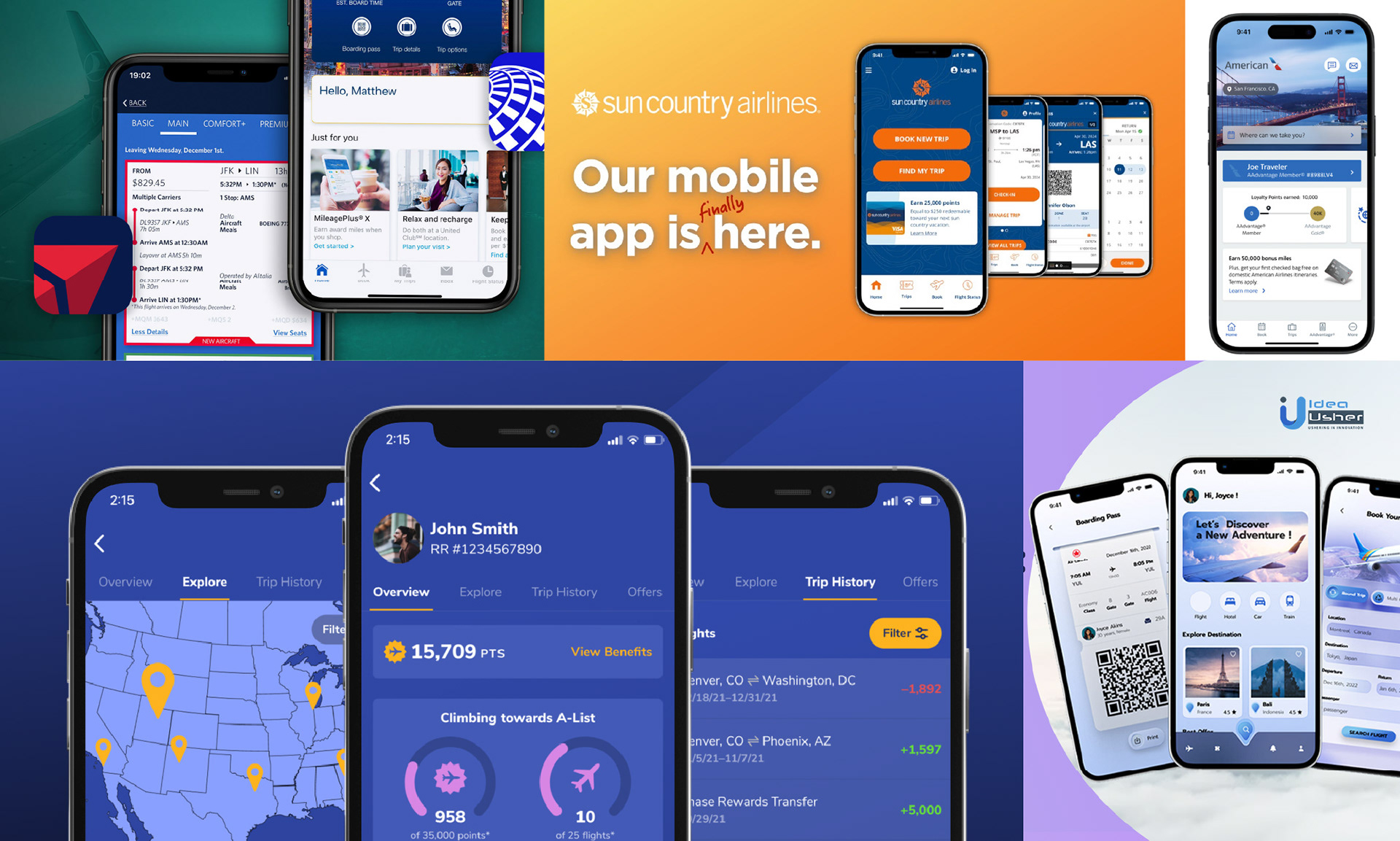
Extensive research and exploration of various airline applications and interfaces were conducted to identify a central concept for development. Subsequently, distinct focal points were identified, and concept sketches were created to visualize the desired direction.
Digital Iterations
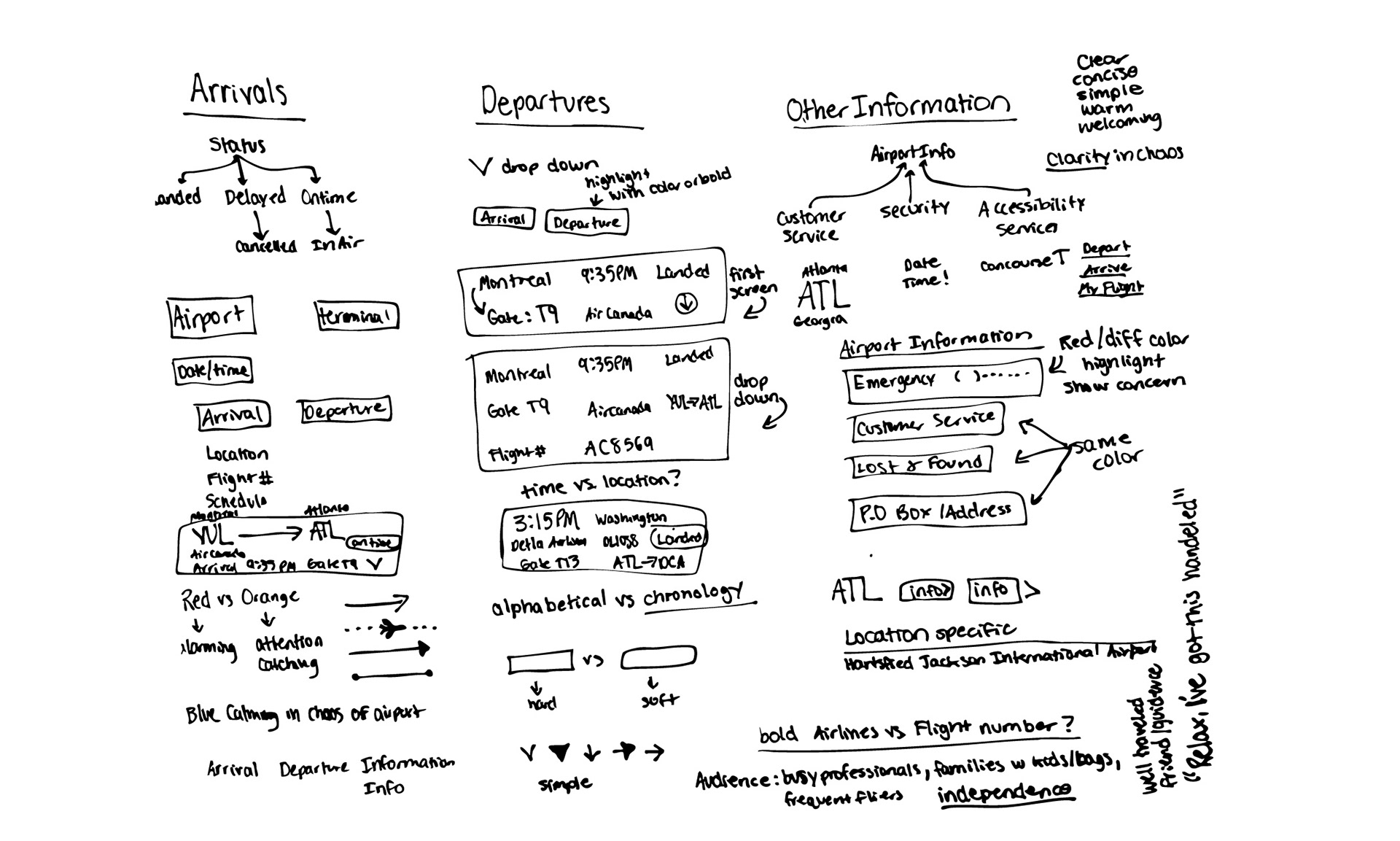
In the course of numerous digital iterations, a wide array of elements were explored, including symbols, icons, the juxtaposition of time and location, typeface, and strategic color usage. This comprehensive experimentation was crucial for the development of a clear and purposeful design direction.
Color and Typography Study
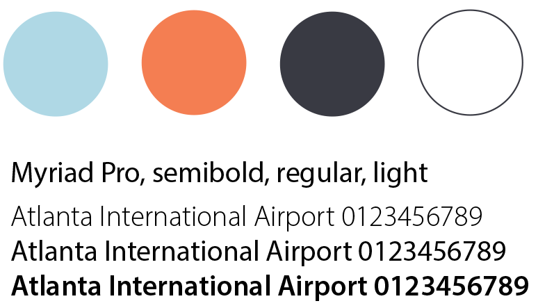
A dark blue, white, light blue, and orange color palette offers a harmonious balance, with dark blue conveying trust and reliability, while light blue and white ensure clarity and a serene user experience. The light orange adds a warm, attention-grabbing accent that enhances user engagement without being overwhelming.
Final
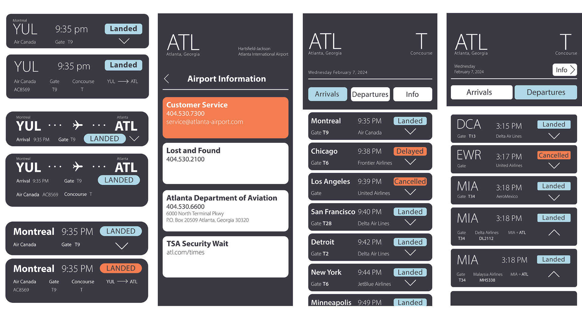
Upon completing the required four screens, I took the initiative to design a home screen with simple navigation, establishing a clear and welcoming entry point to the interface. This project created a mobile-optimized flight information display system, enabling passengers to access real-time updates effortlessly. The design focused on a clear, concise, and visually appealing interface to enhance user experience and foster guidance and independence.