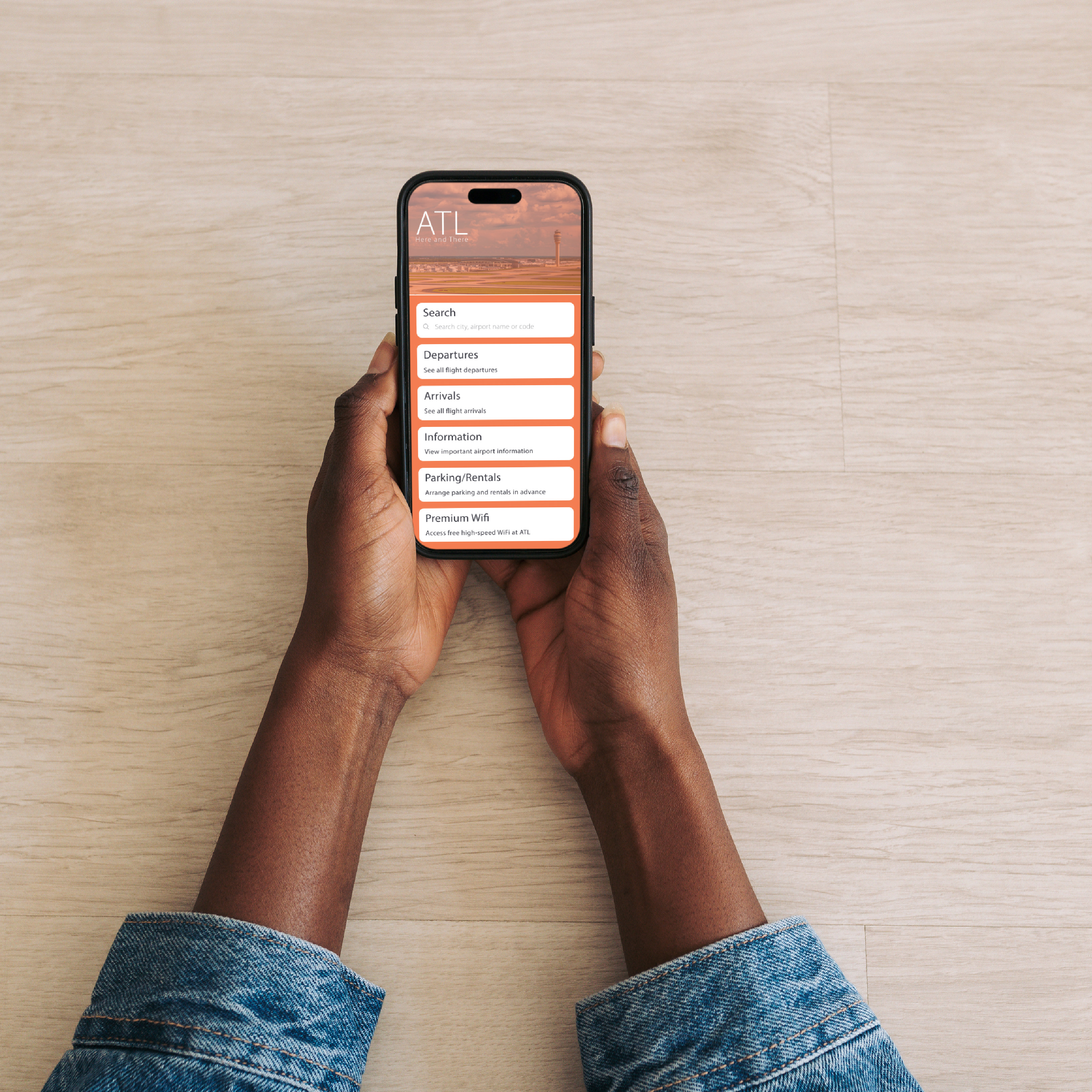
Craigslist Redesign
Redesigned Craigslist to create a more trustworthy and accessible interface that appeals to a broad audience. The project focused on enhancing usability and navigation across devices while maintaining the familiar browsing and posting experience. Through modern UI principles, a cleaner layout, and improved visual hierarchy, the design reduces information overload, strengthens user confidence, and improves discoverability and interaction within a responsive, consistent framework.
Pain Points
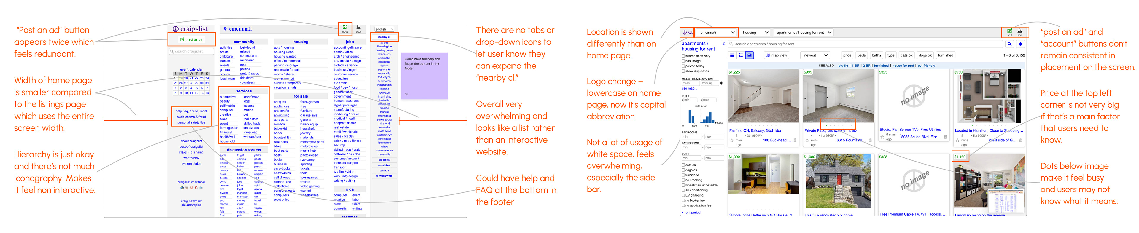
Evaluated the original Craigslist interface to identify usability and visual issues. Key challenges included cluttered layouts, inconsistent spacing, limited visual hierarchy, and outdated typography. The overwhelming amount of text and minimal imagery made navigation difficult and reduced user trust, highlighting the need for a cleaner, more intuitive design system.
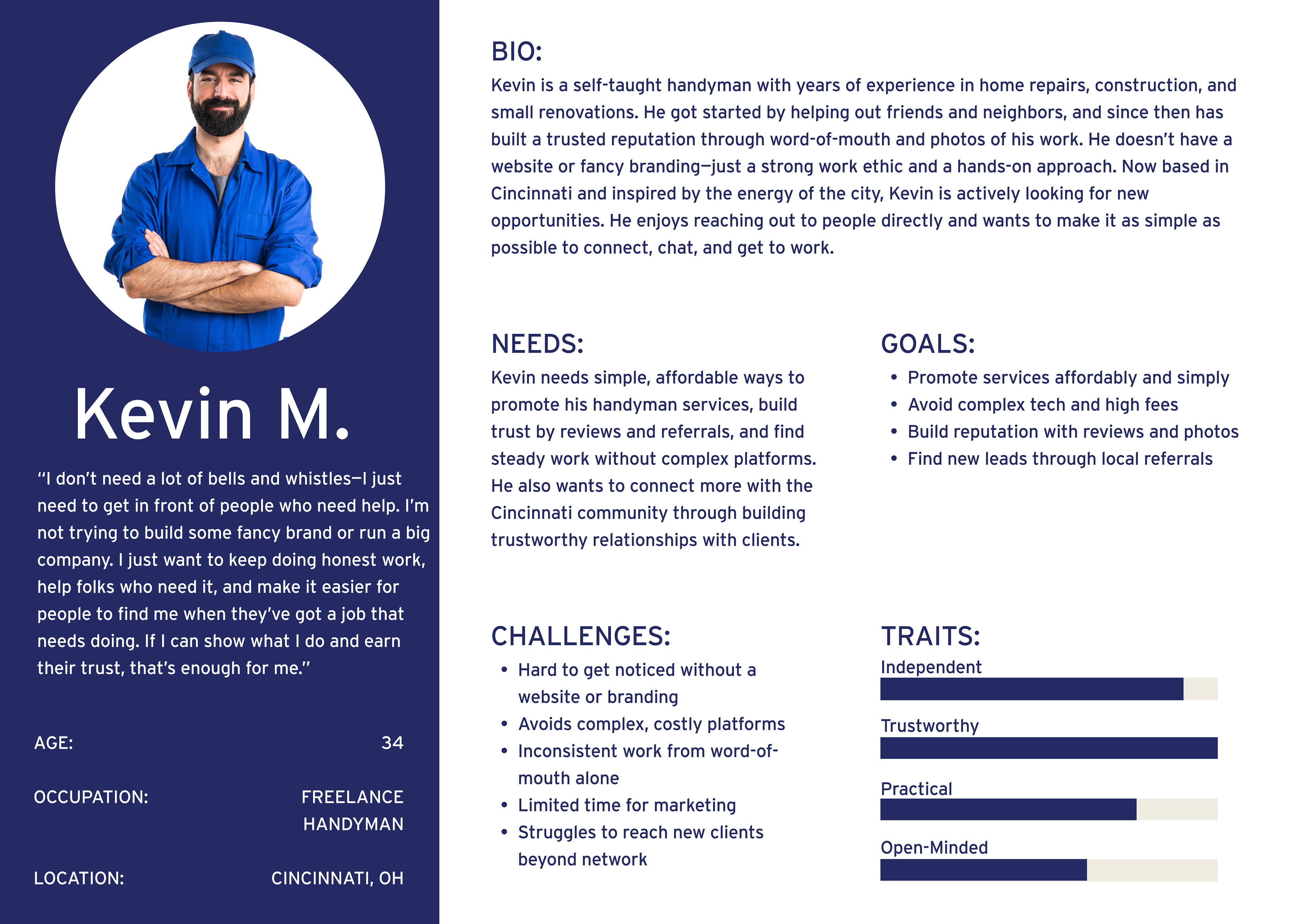
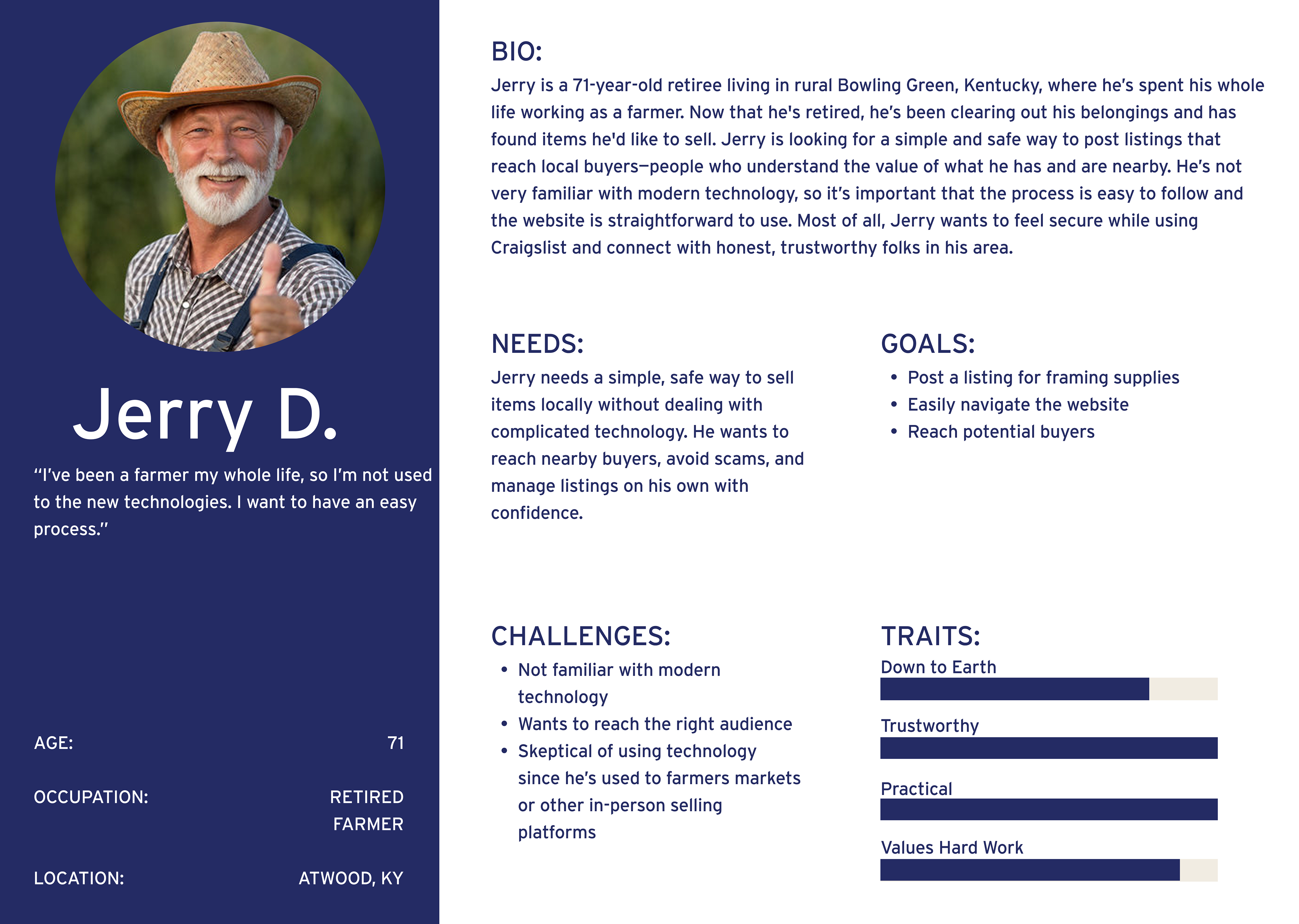
User Personas
Research focused on users seeking simple, trustworthy ways to post and find listings, along with those needing an easy, accessible interface. These insights shaped task flows centered on clarity, usability, and confidence across all interactions.
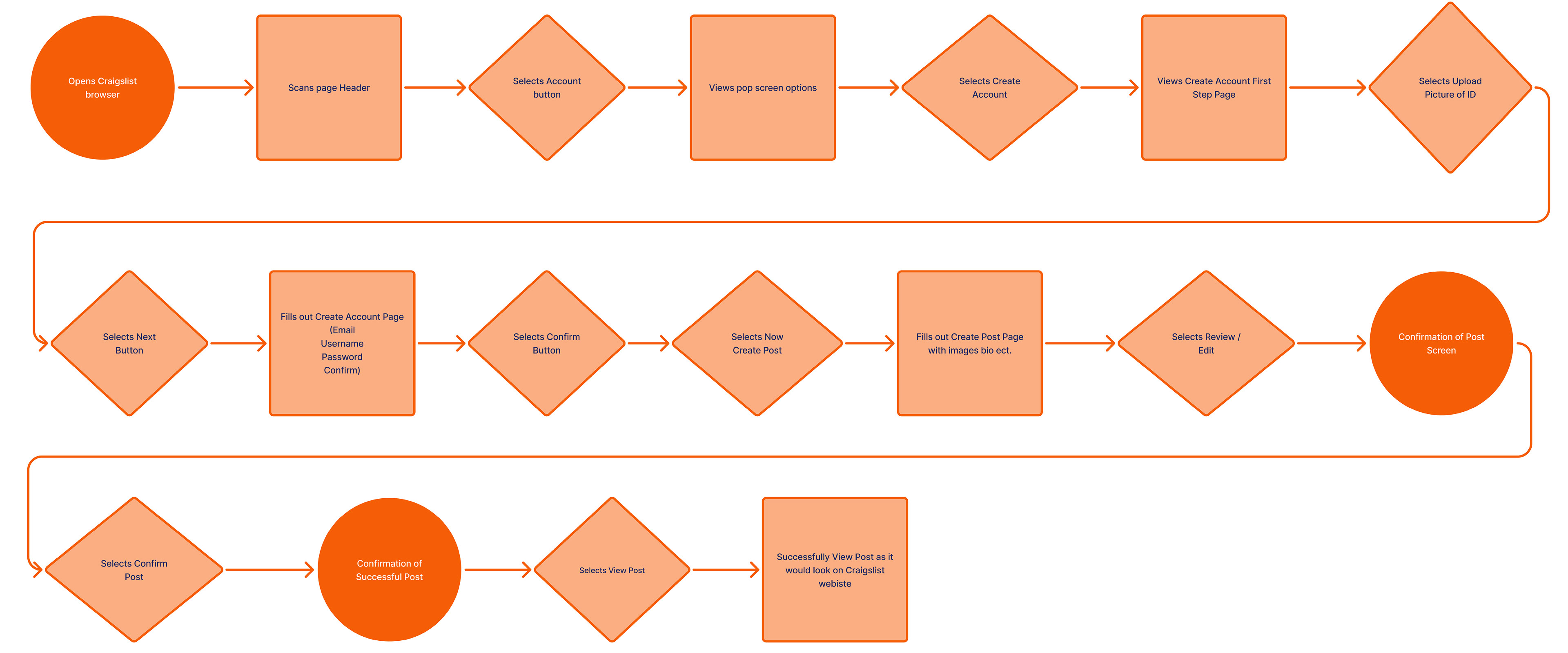
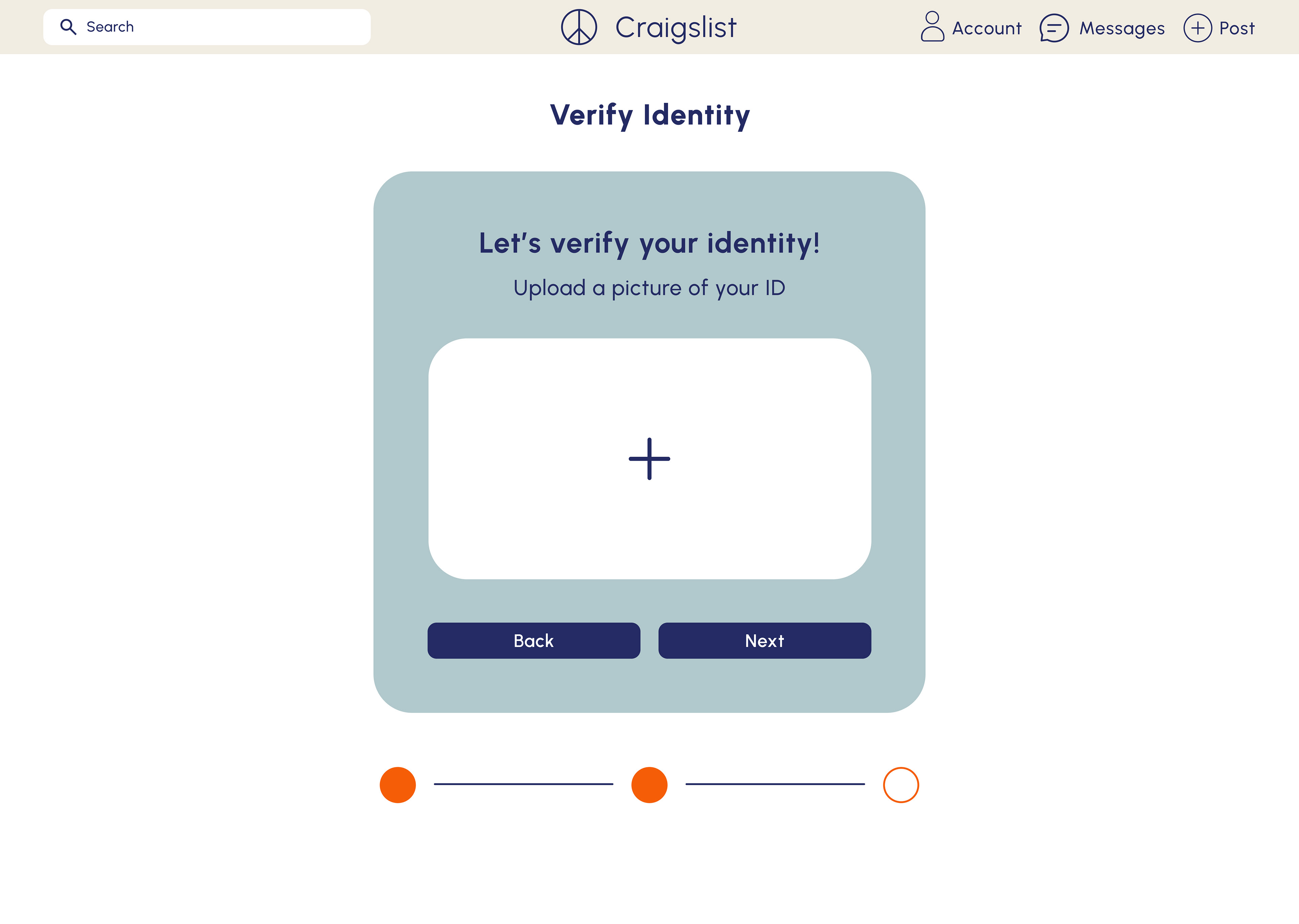
Task Flow 1: Posting
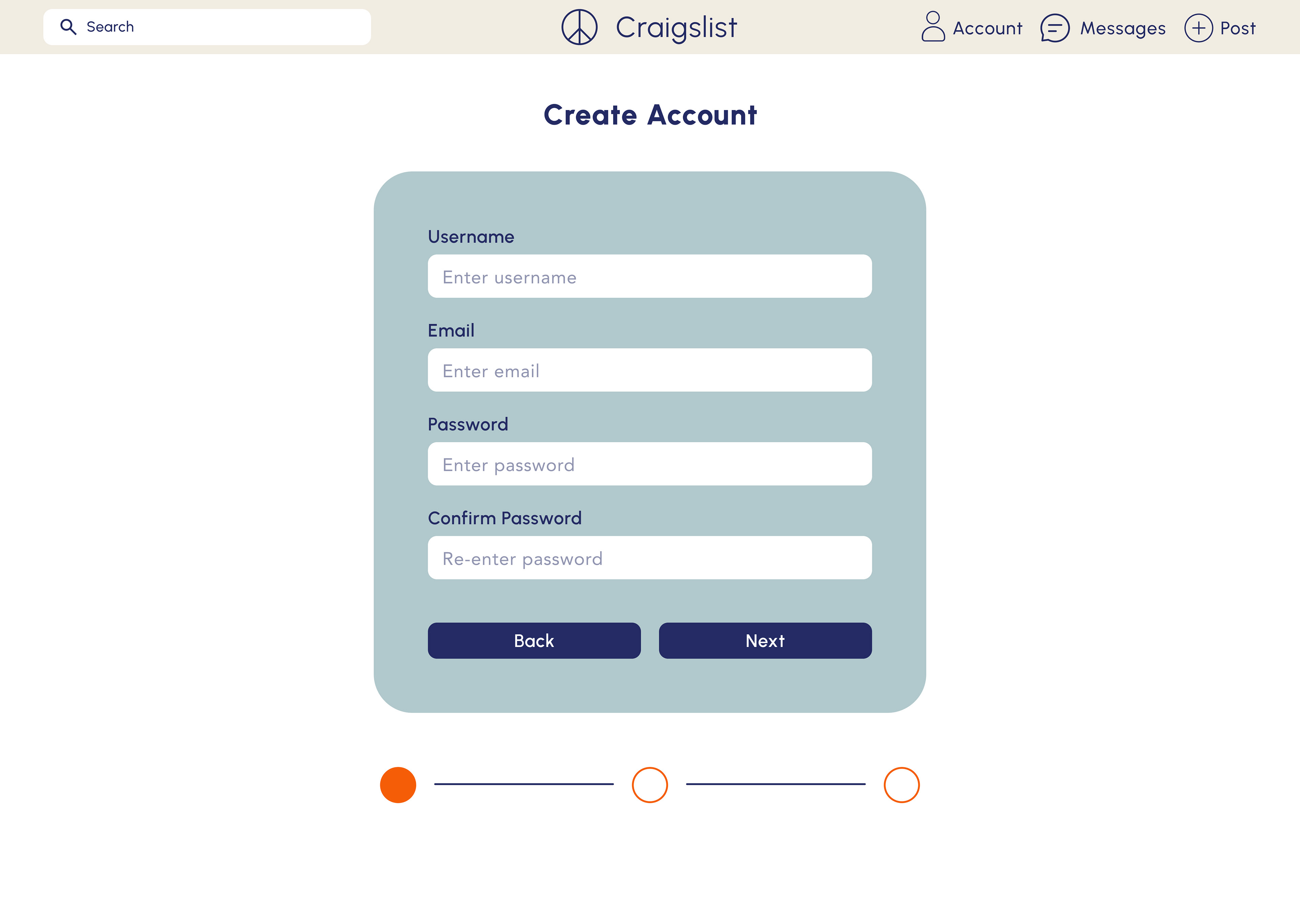
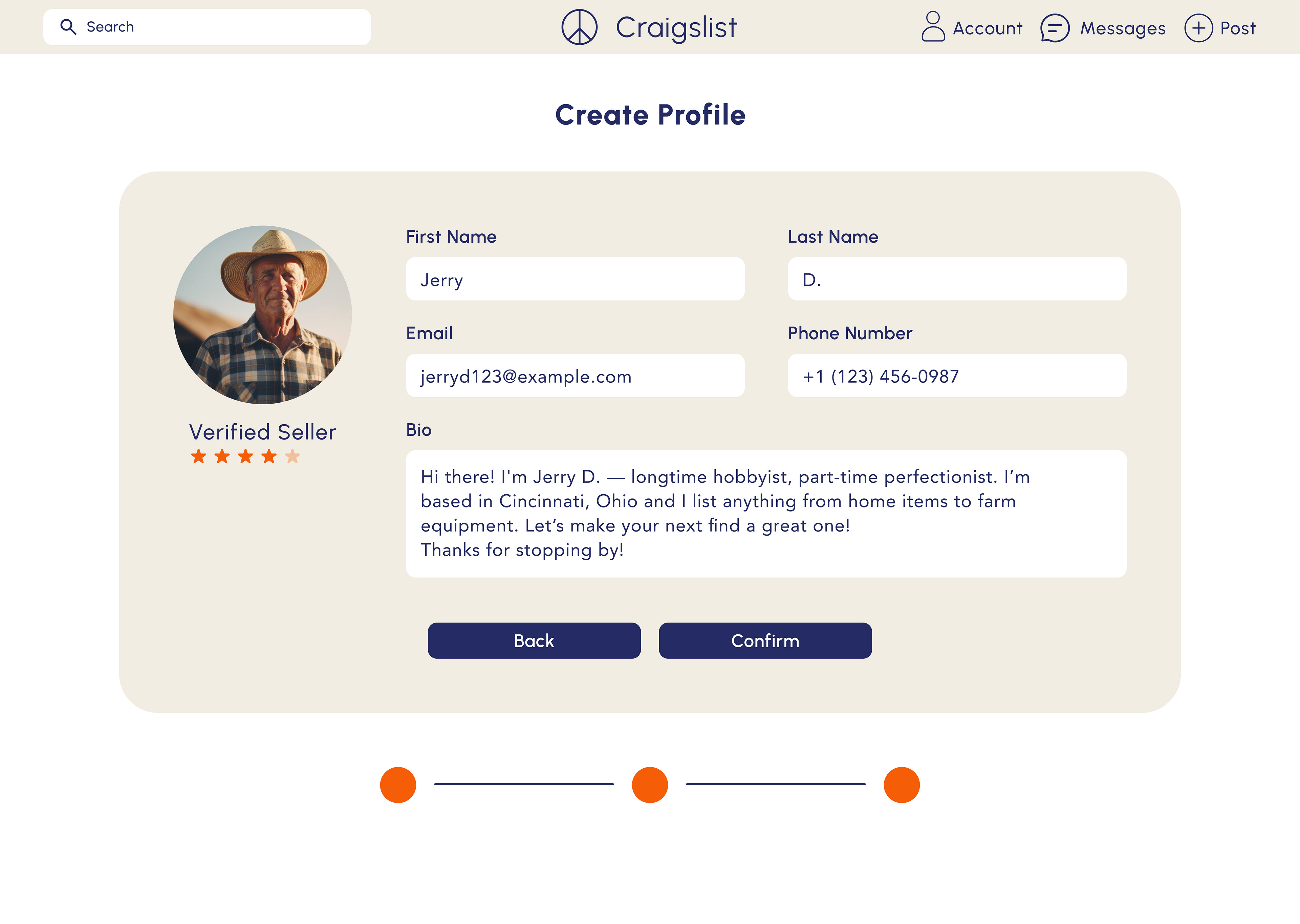
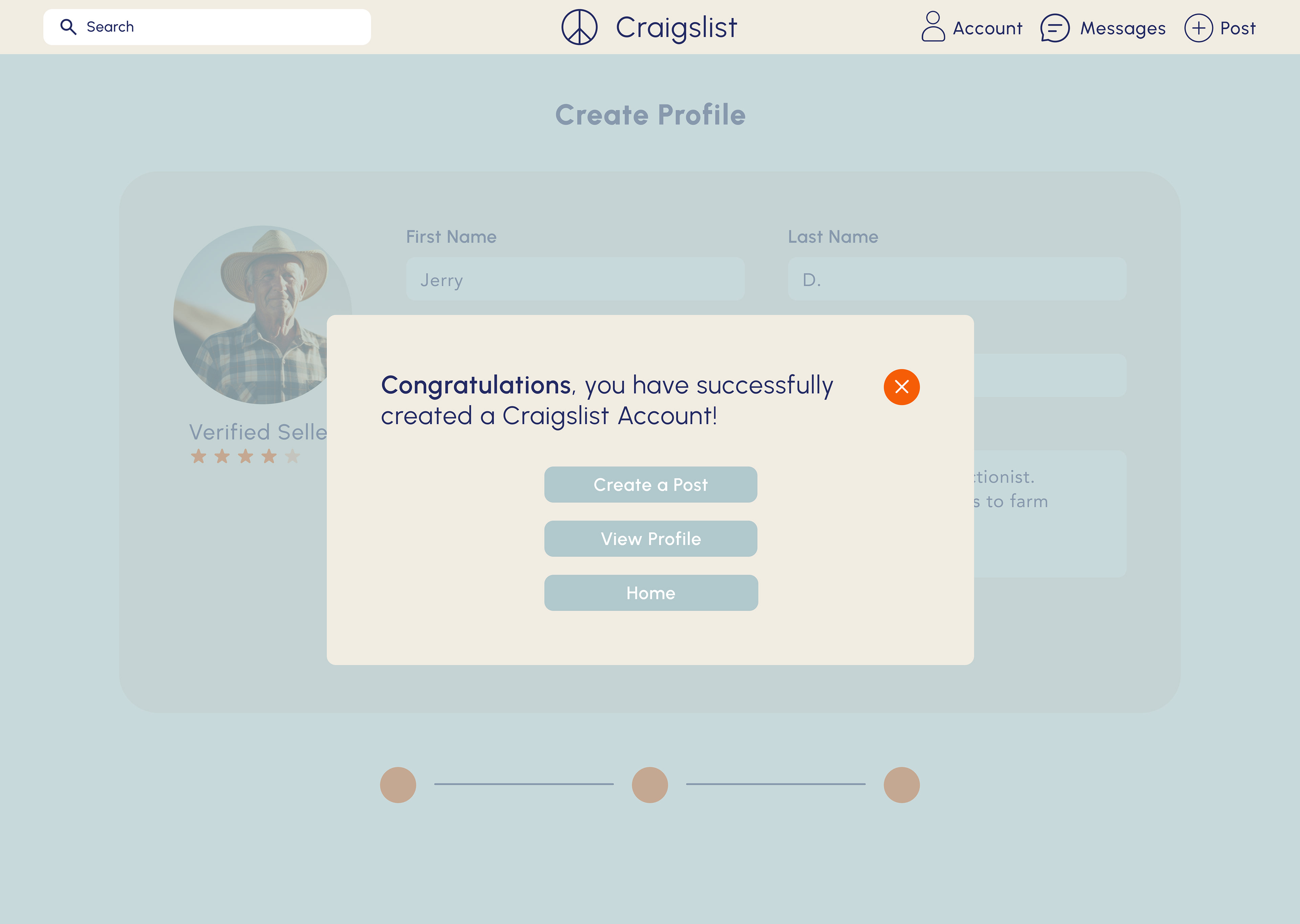
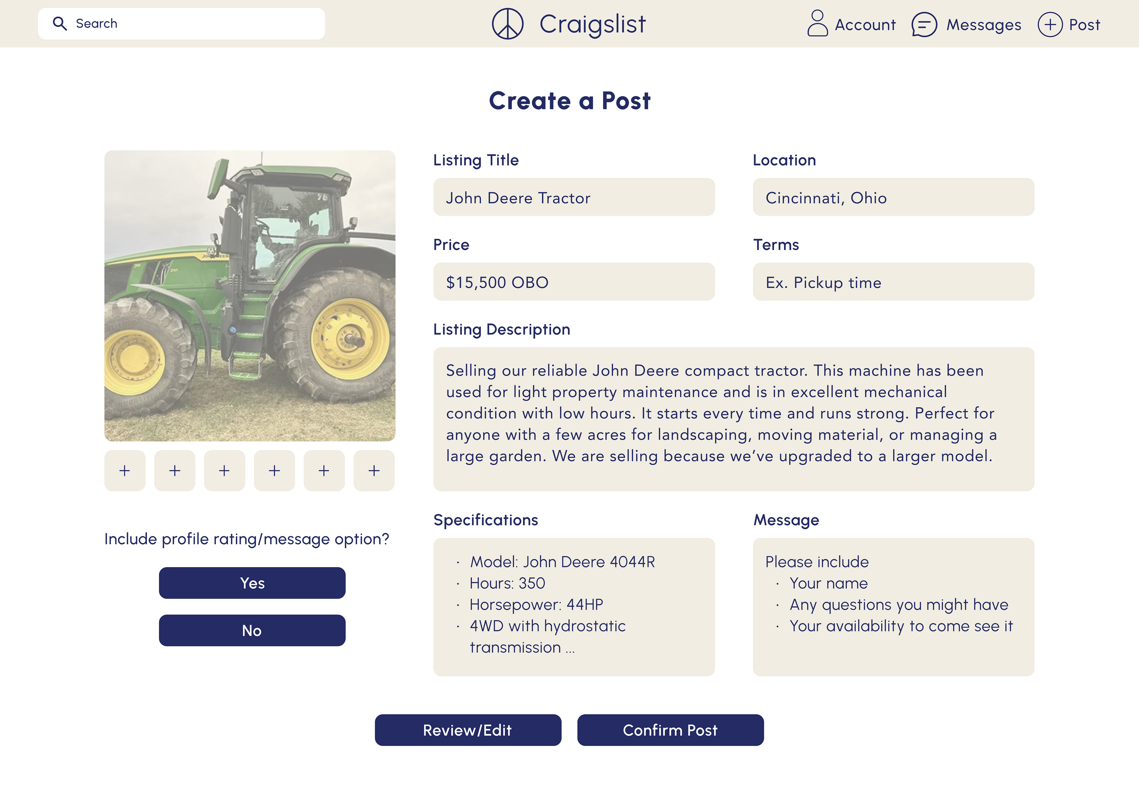
Task flow 1 ensures a structured and intuitive process for posting an advertisement on Craigslist, minimizing errors and streamlining the user experience. Each step including account creation, identification upload, and post confirmation aligns with Craigslist's requirements while enhancing clarity and efficiency.
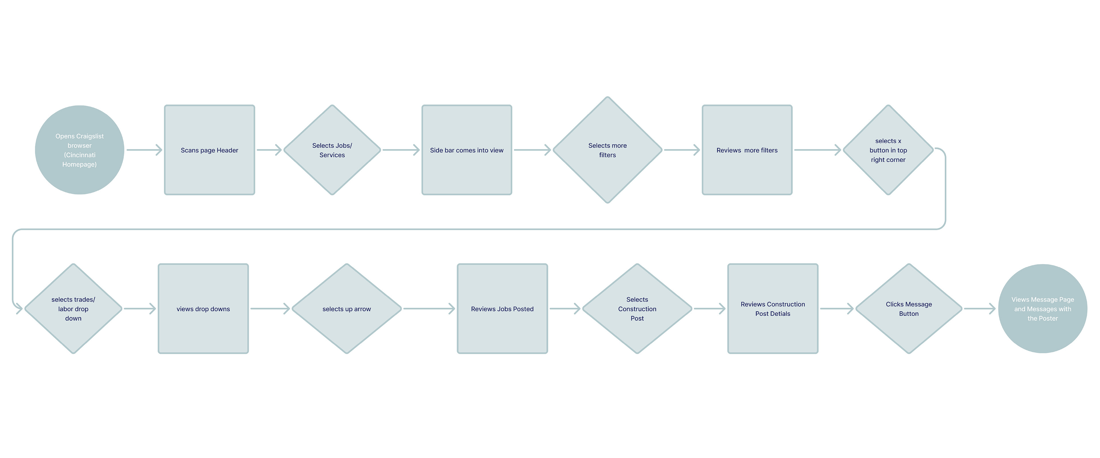
Task Flow 2: Job Application
Task flow 2 outlines a common user journey: finding/applying for a job through a structured, step-by-step process. Clear navigation and progressive filtering reduce overwhelm, leading to a confident, confirmed submission.
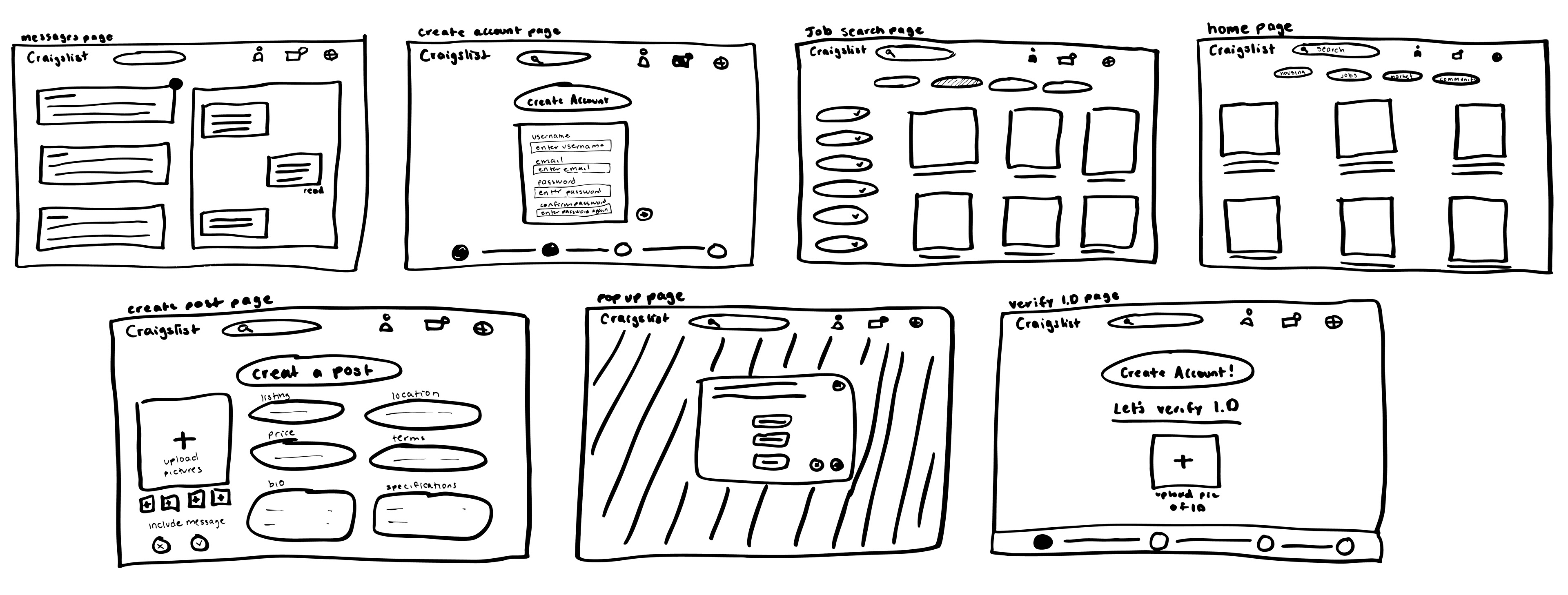
Sketches
Initial sketches explored cleaner layouts and improved hierarchy, focusing on simplifying navigation and organizing key actions to build a clearer, more intuitive user flow.
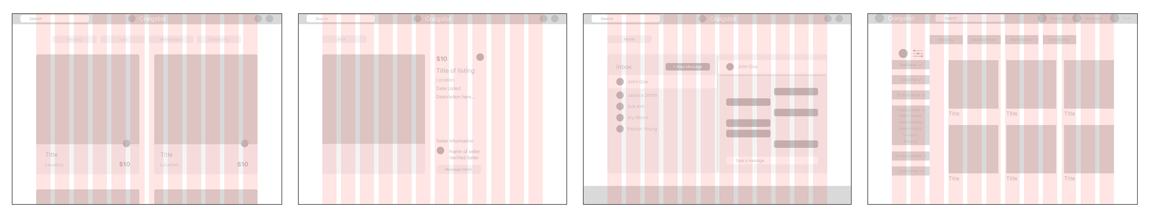
Lo-Fi Wireframes
Built on a 12-column grid with 24px gutters, the wireframes establish consistent layout, clear navigation, and a balanced visual structure.
Hi-Fi Wireframes
Refined layout, typography, and color palette to enhance clarity and trust. Soft blues and neutrals modernized the interface while keeping it approachable.
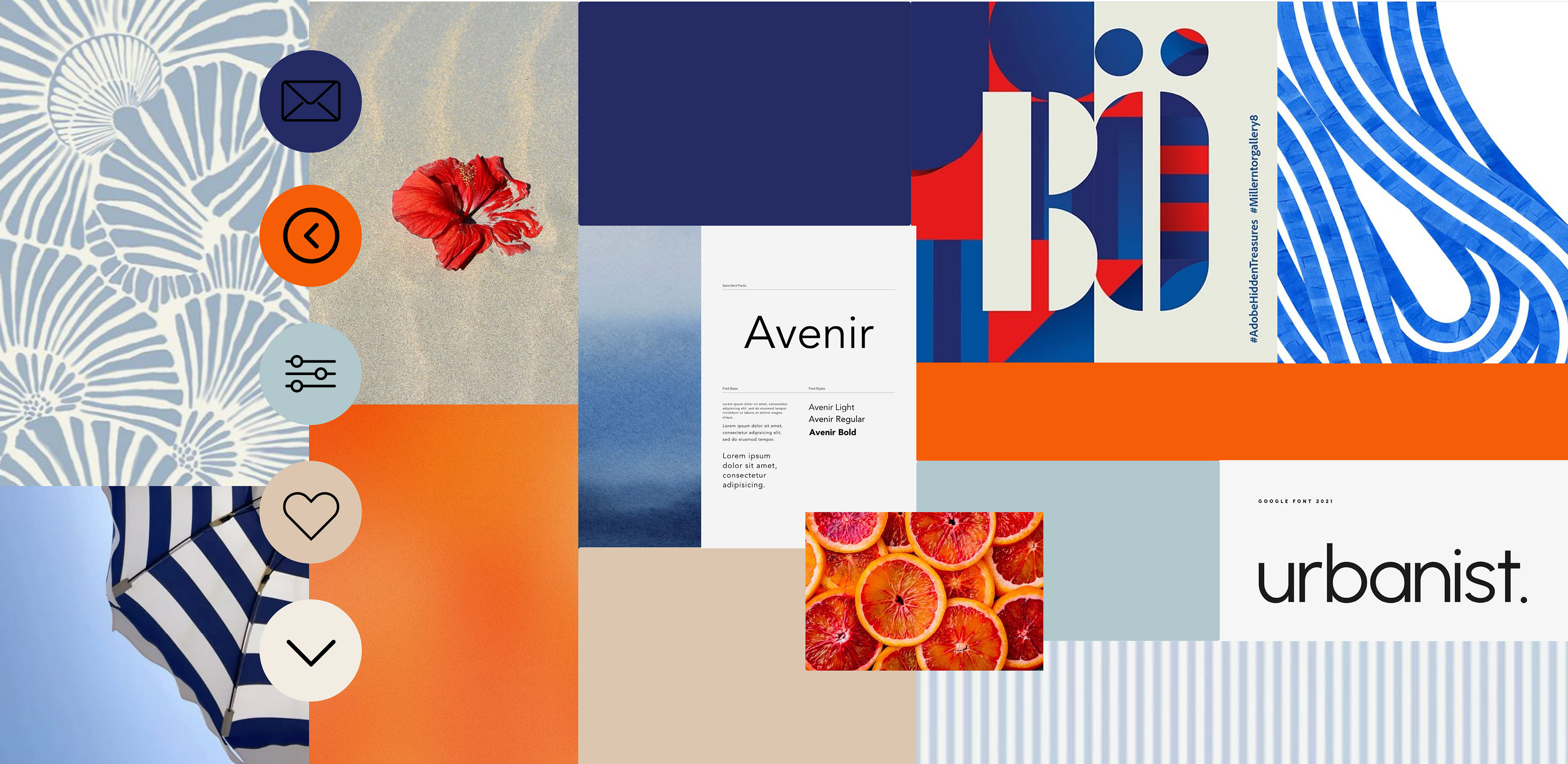
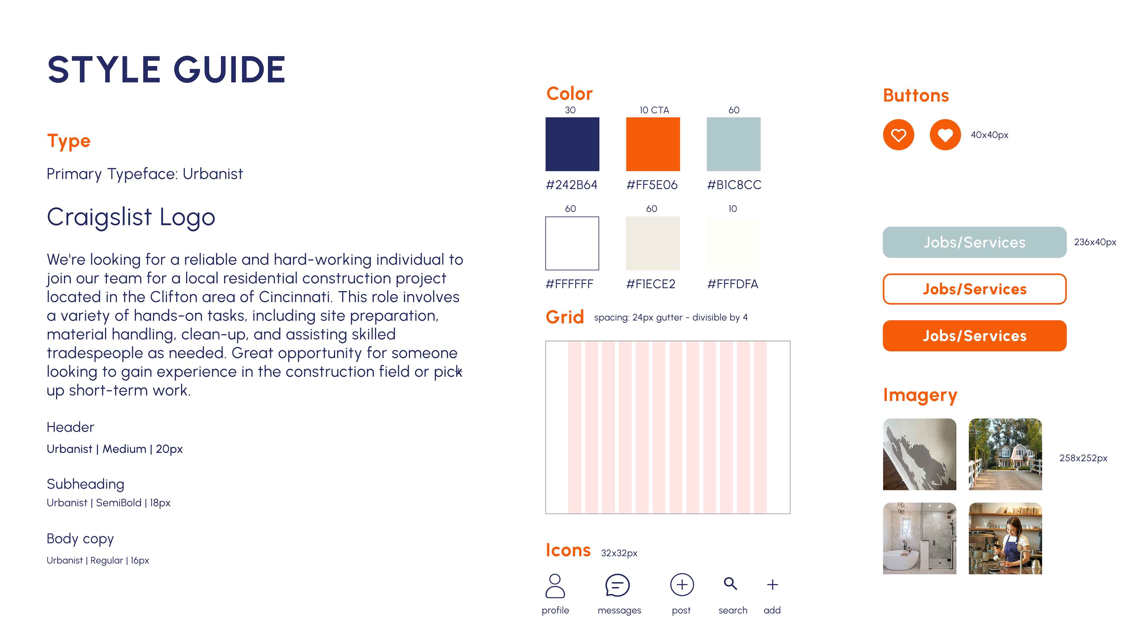
Mood board / Style Guide
Defined a modern yet familiar aesthetic through a neutral color palette, clean typography, and subtle iconography. The style guide established visual consistency across layouts, reinforcing trust and readability while maintaining Craigslist’s straightforward character.
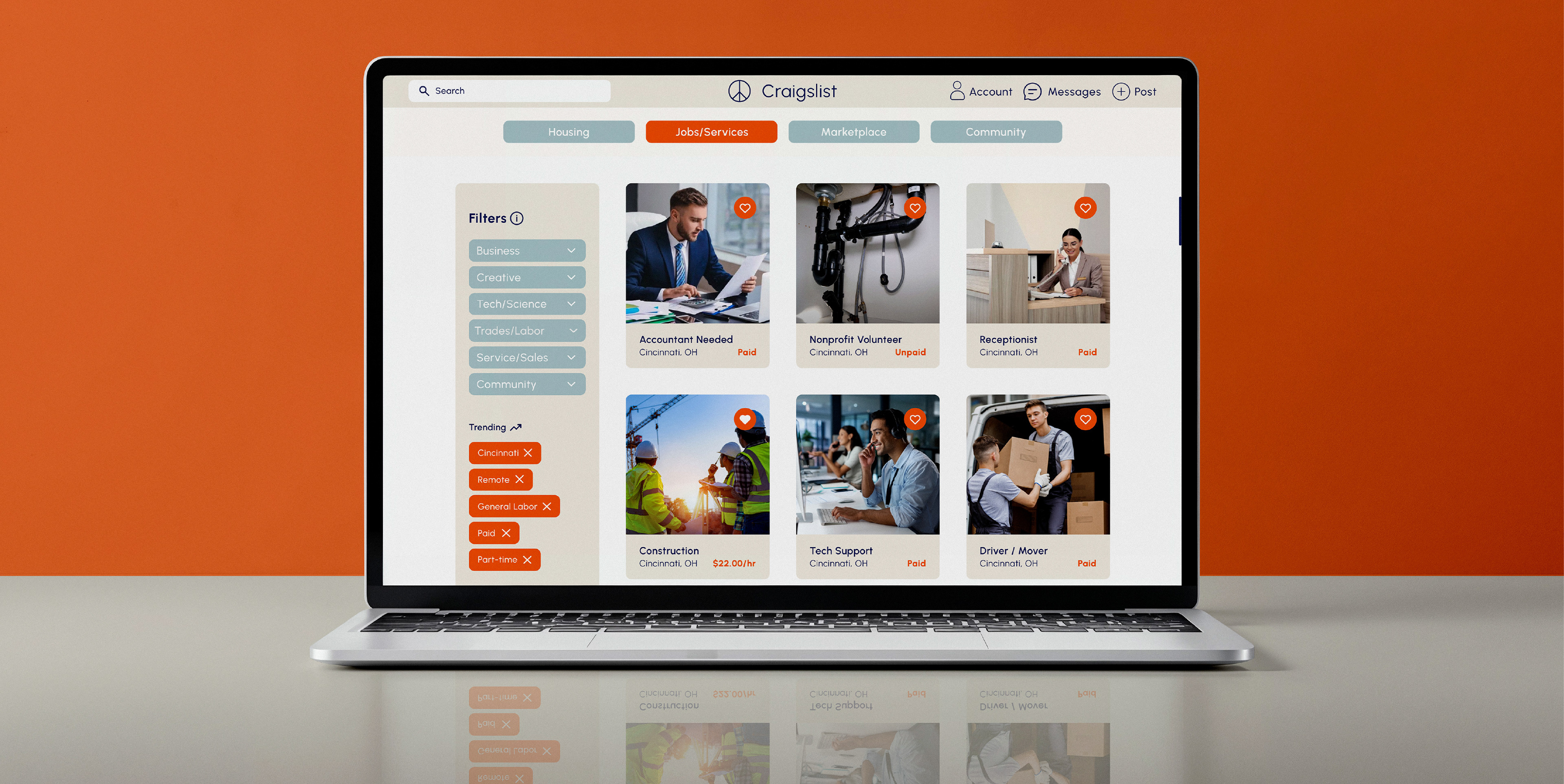
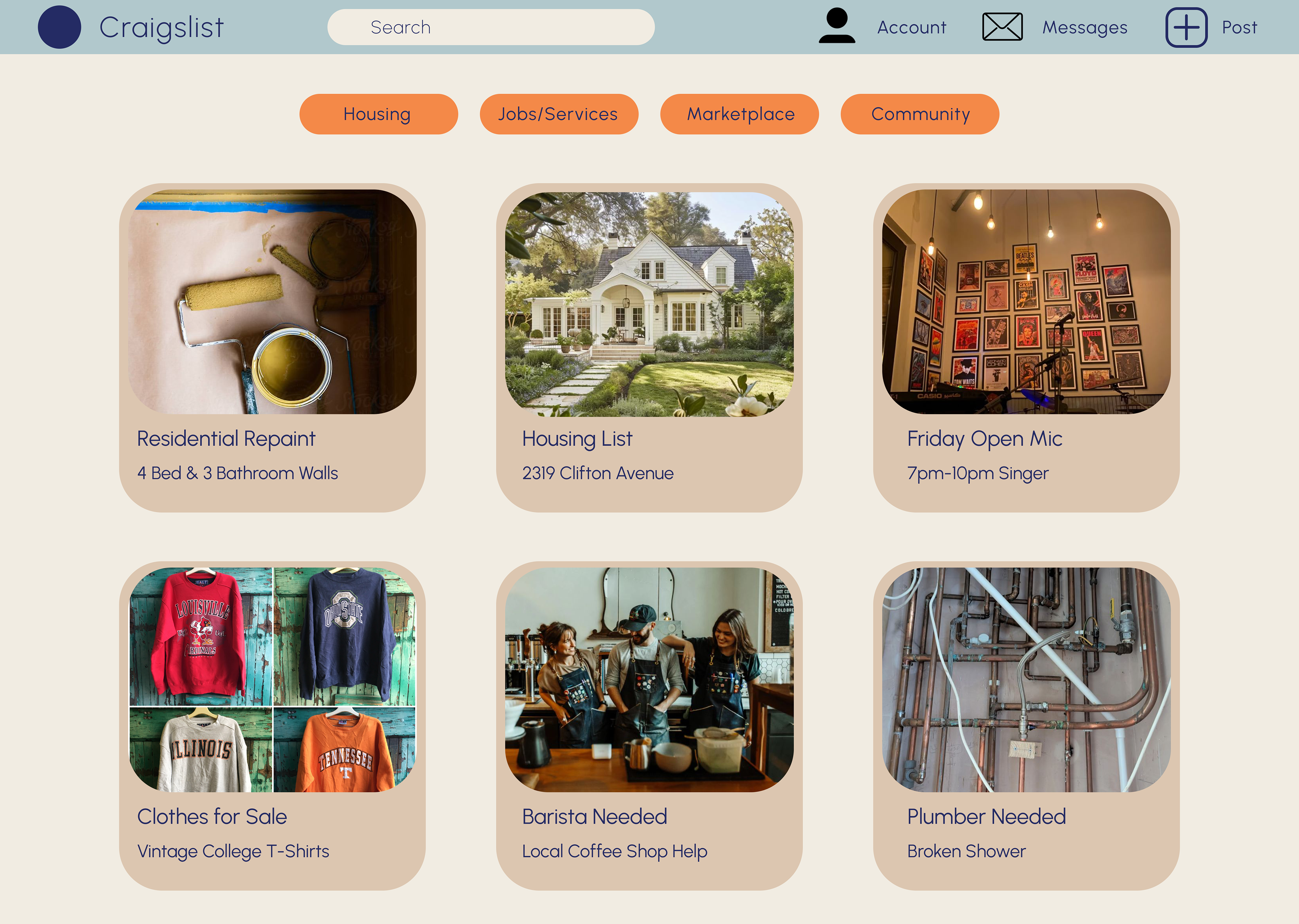
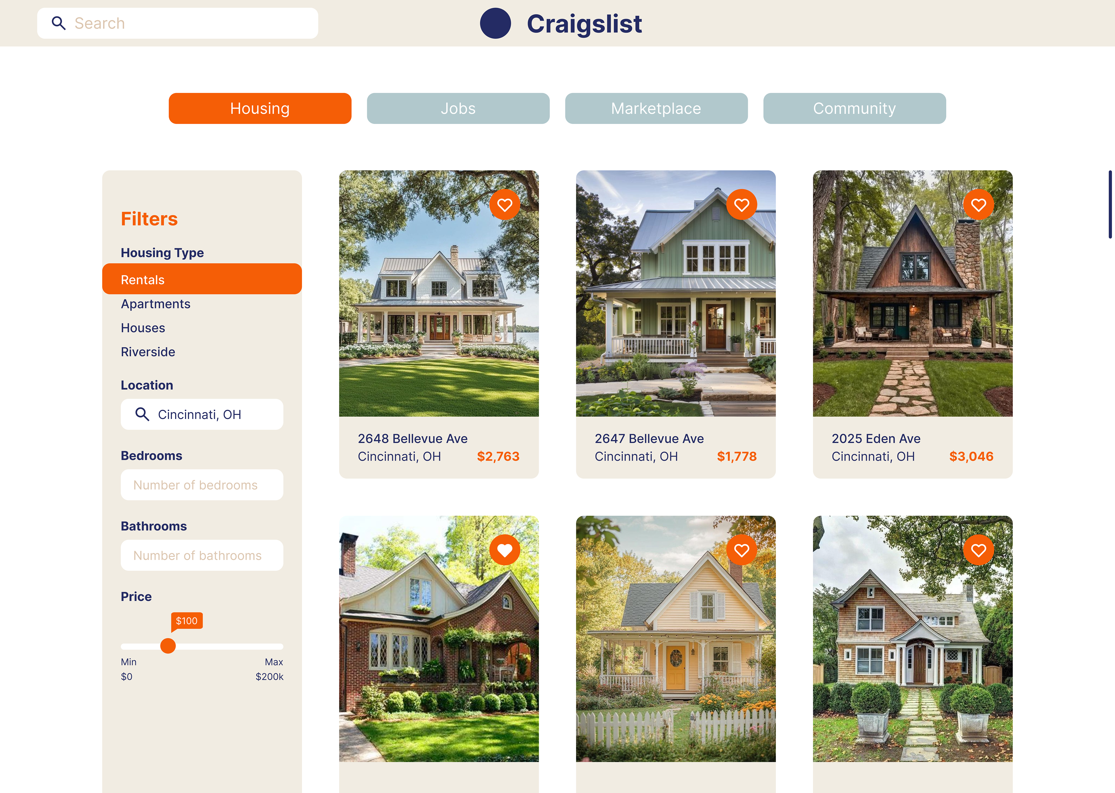
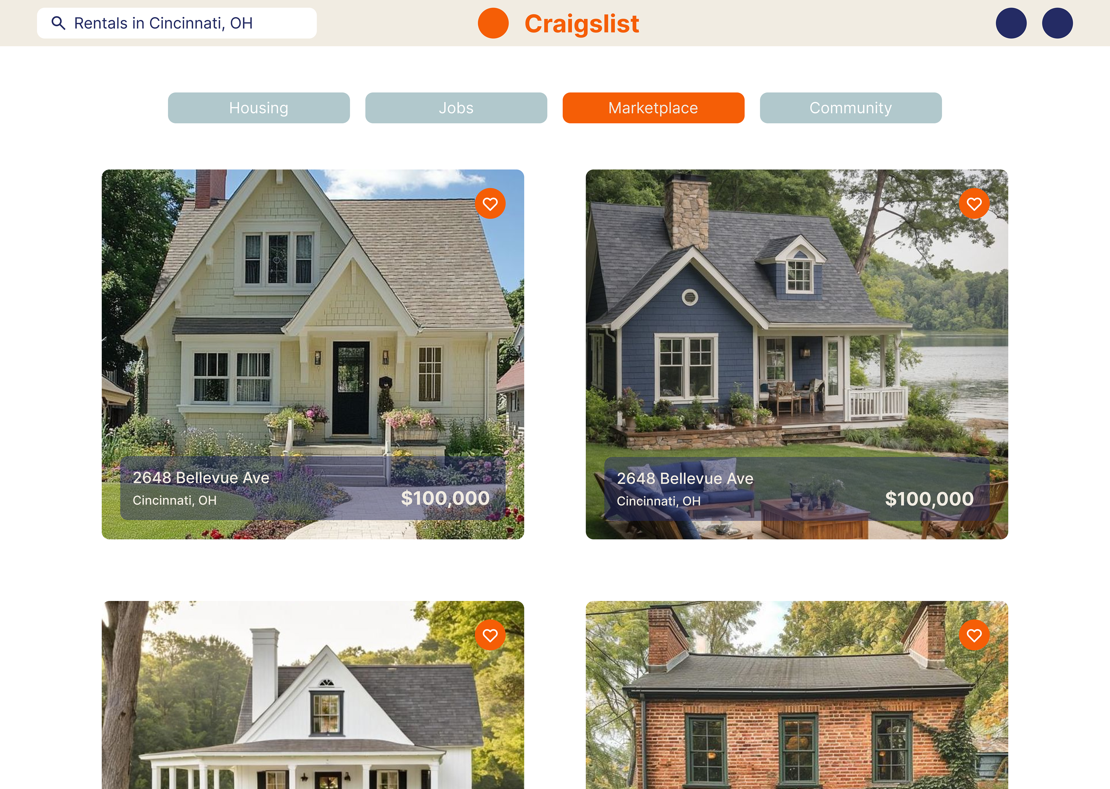
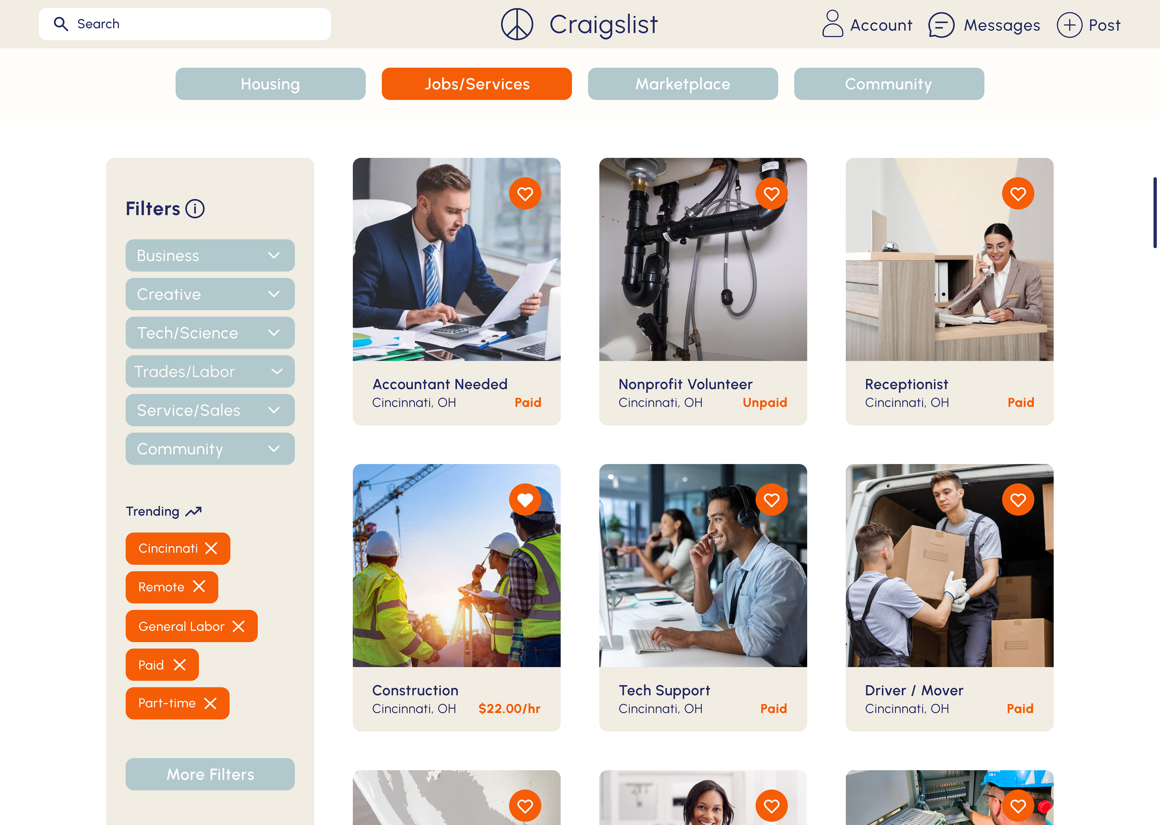
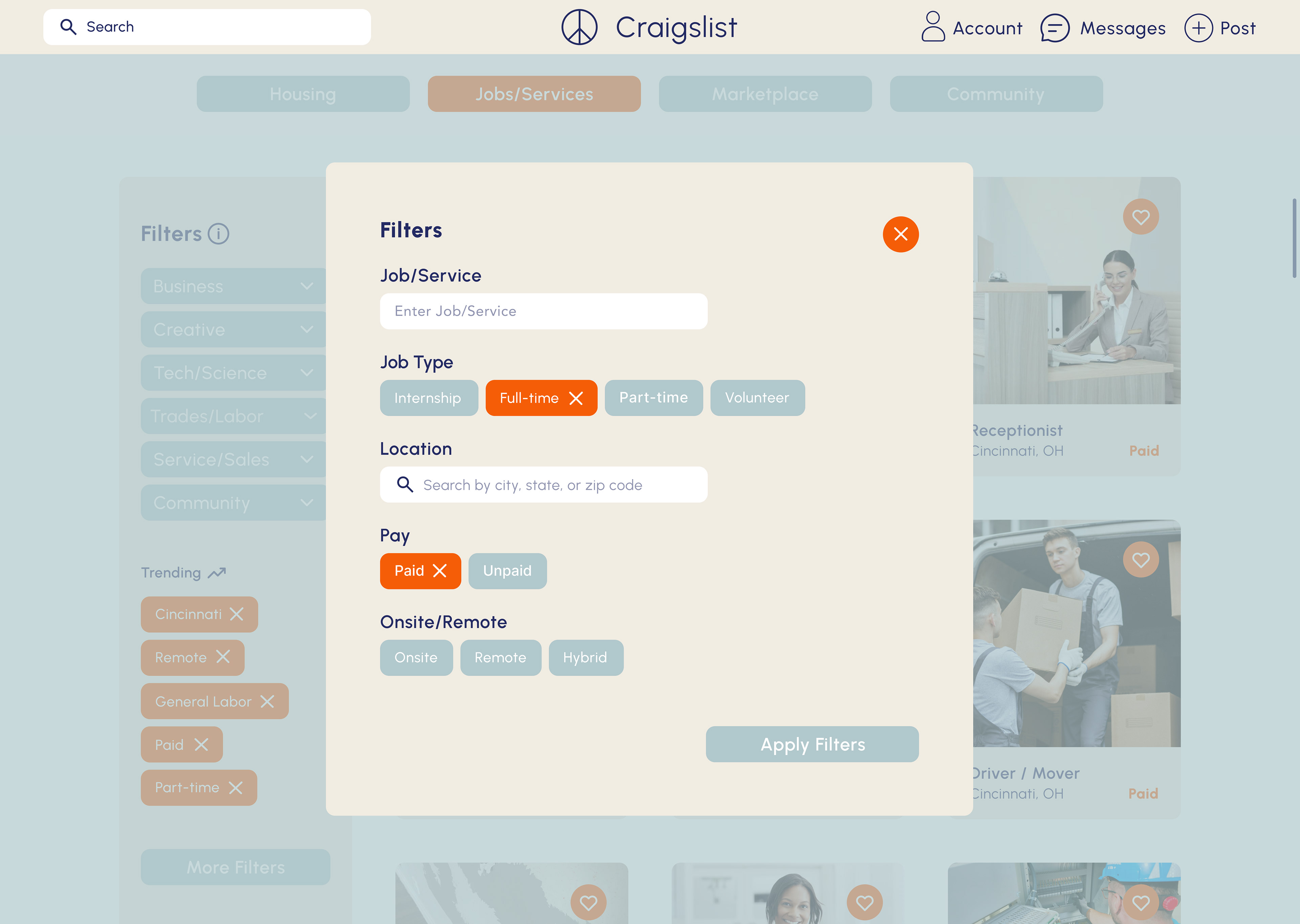
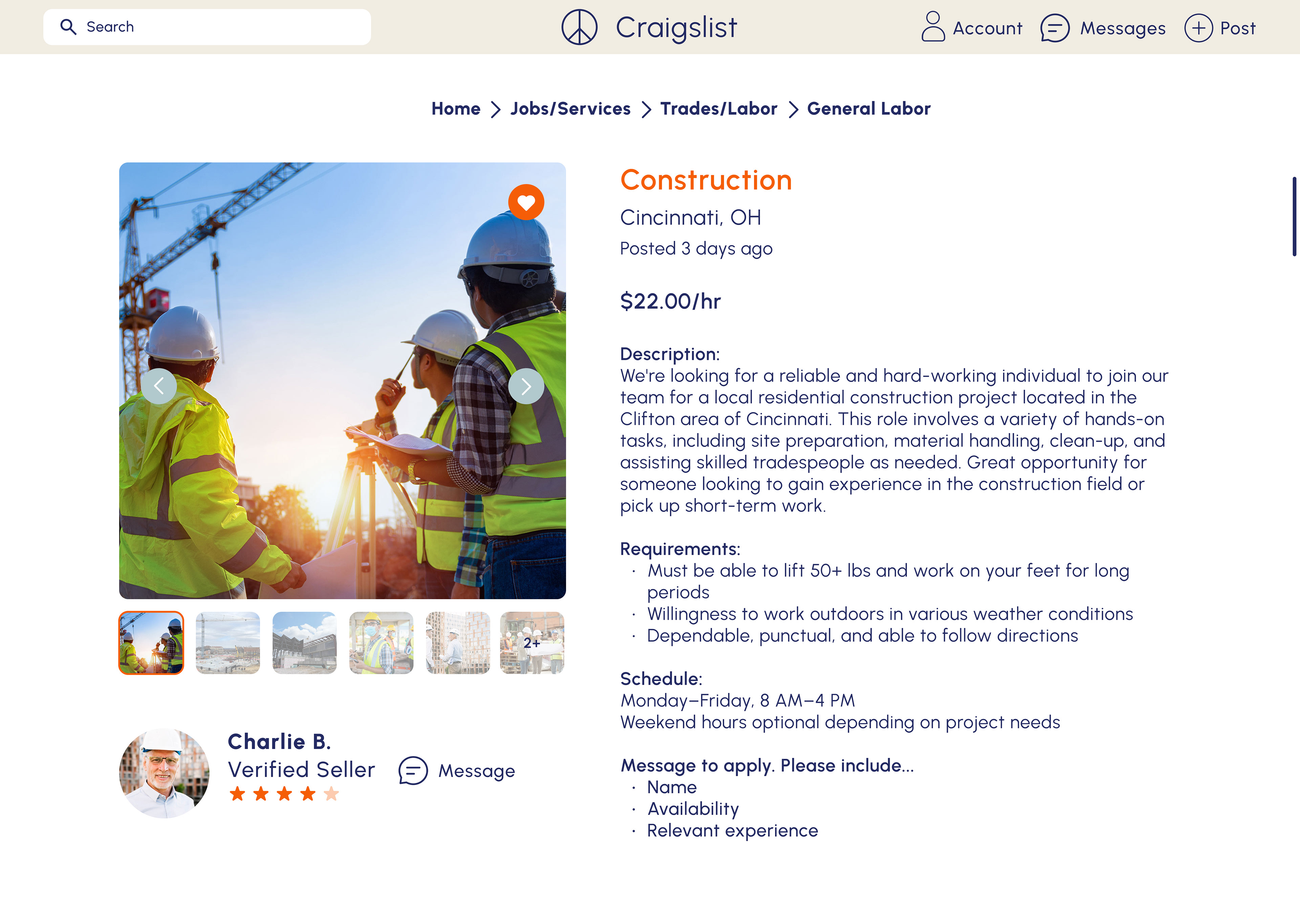
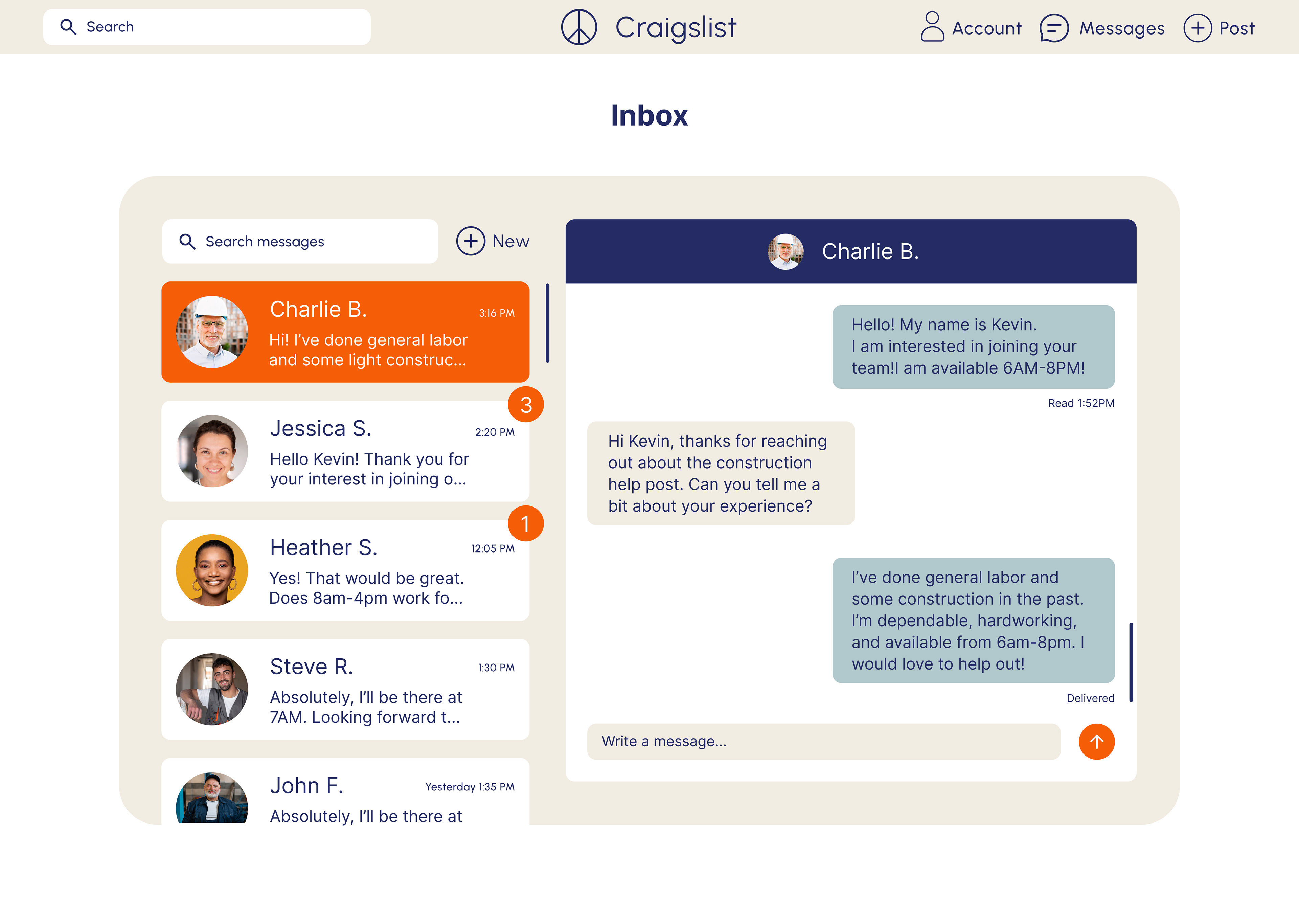
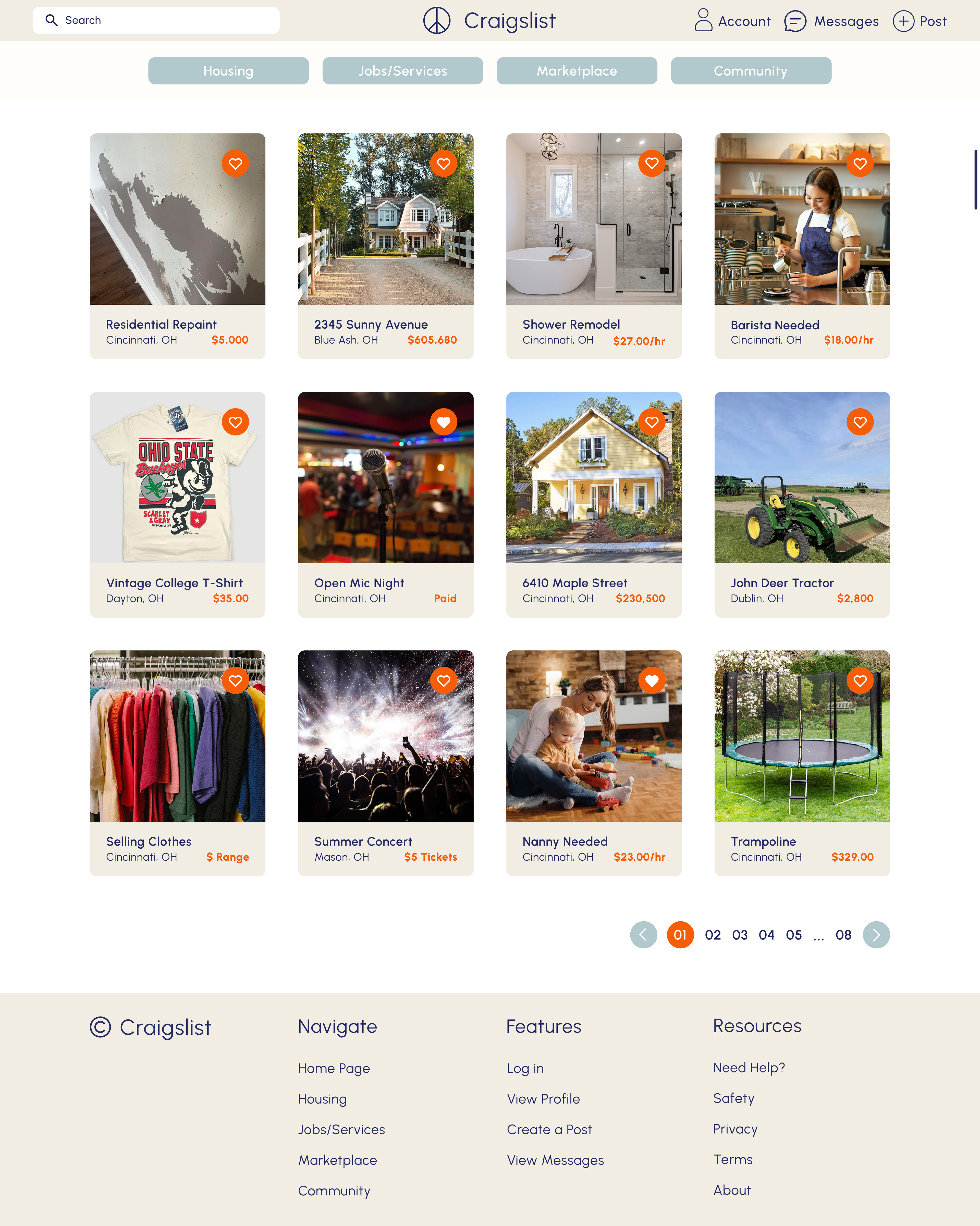
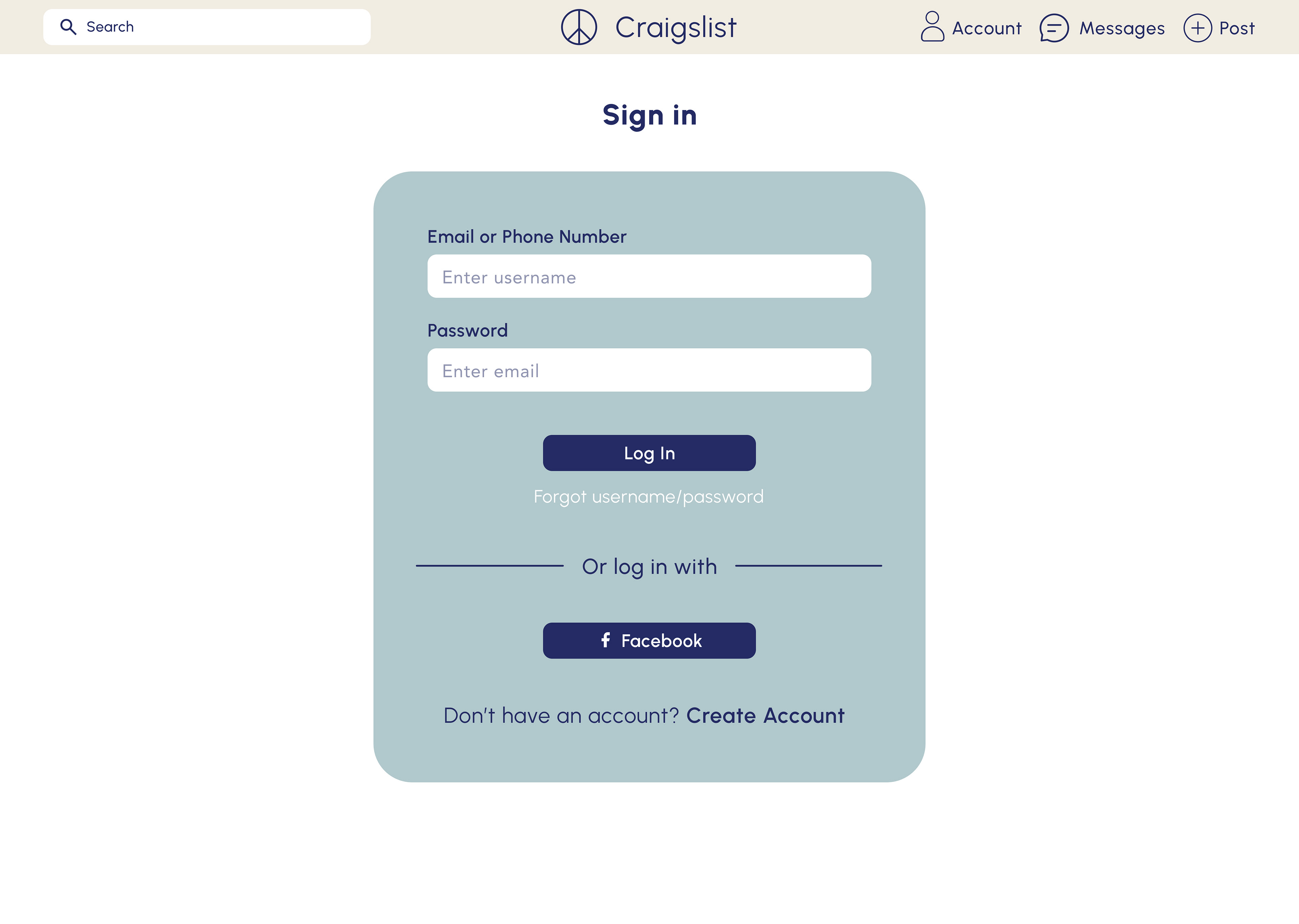
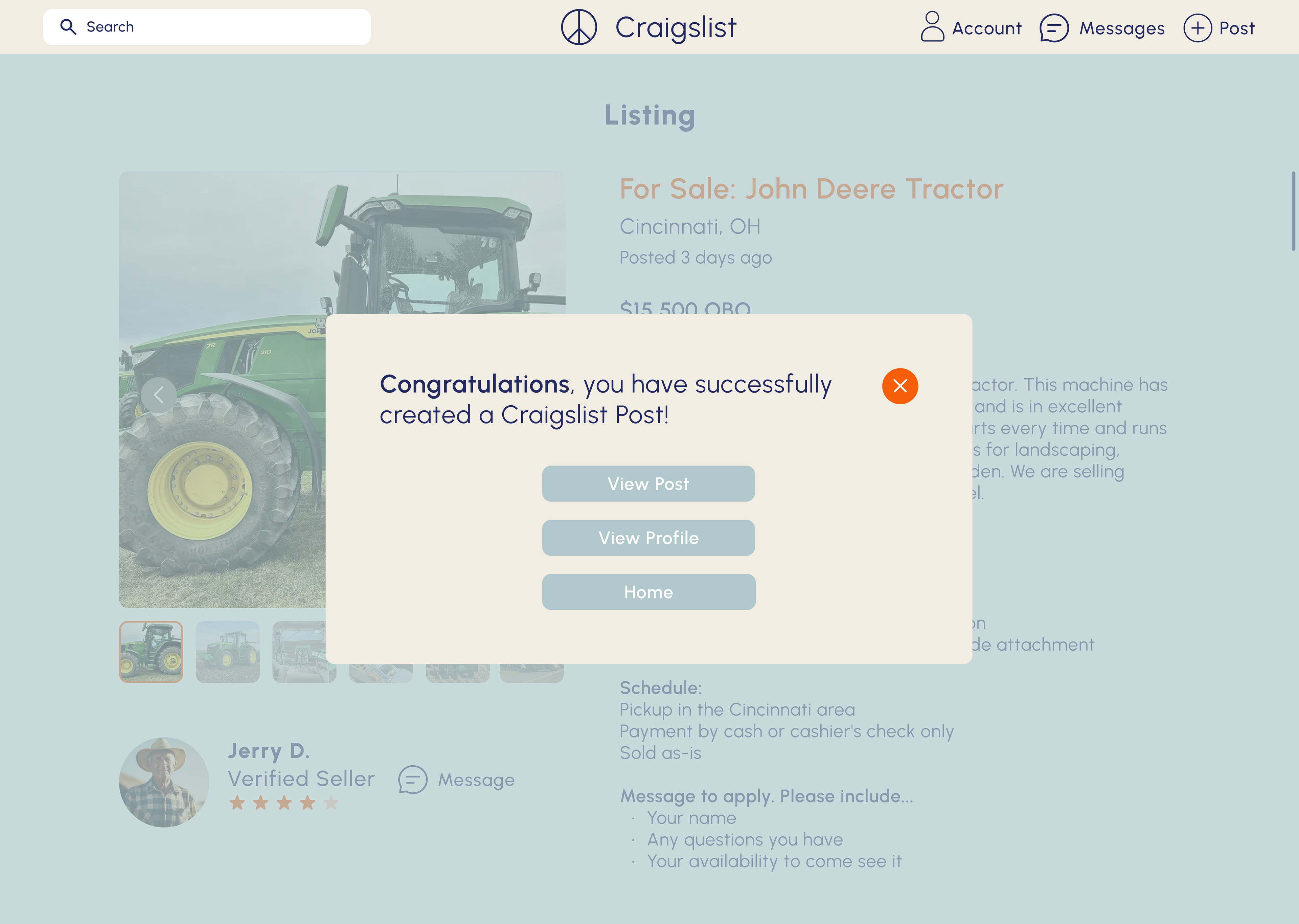
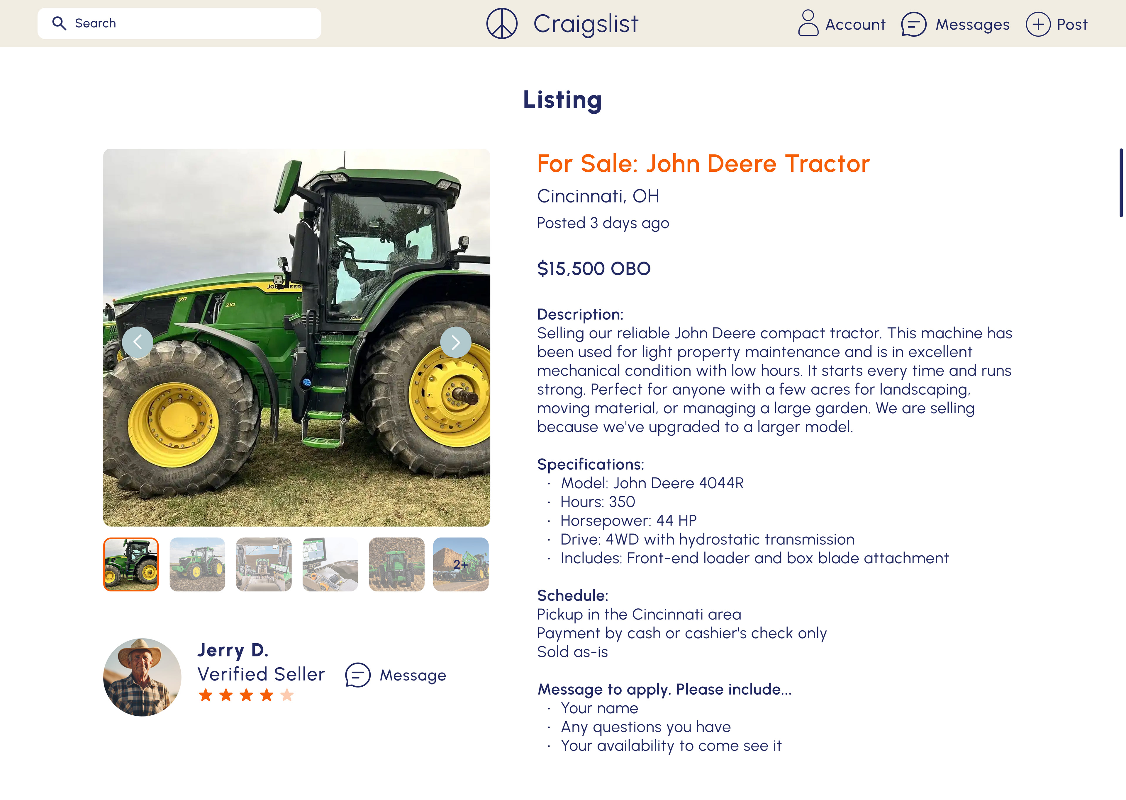
Final Screens
The redesigned screens showcase a clean, organized interface with improved hierarchy, clear navigation, and responsive layouts. Visual consistency and modern UI elements enhance usability while preserving Craigslist’s familiar experience.
Final Prototype
All prototyping was done in Figma.